Jake Kuramoto from Oracle Apps Lab has a great post about common search terms for the three main search engines and notes that ‘facebook.com’ (and variants thereof) appear in the lists of most frequently used keywords.
Recently, I have been observing my wife who is a non-technical (Firefox) user although I must admit to a vested interest here. I am keen to understand any areas where Linux Mint is ‘worse then Windows’. Over the last few weeks, I have noted the following:
The Web browser is Firefox 3.6 and the starting page is a single tab - Google.com (my choice).
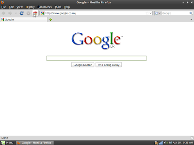
This start page is minimalist in the extreme and dominates the screen. The user is instinctively drawn to this large, central area of the screen. Note to Google designers: This striking, beautiful minimalism is rather spoiled once you use the mouse.
My wife’s Web session starts here. It always starts here. She might be searching for ‘john lewis’, ‘maths revision guides’, ‘how to kill husband and get away with it’ or ‘weather london’. It is entirely logical that, if she wants to visit Facebook, she will simply hit ‘Home’ and initiate another ‘mini-session by searching for ‘facebook’ (or some variant).
This may not the the quickest, optimal way of getting the job done but it’s quick enough, it works and it is a learned behaviour.
I agree about search being more forgiving than typing raw text into the address bar. Google does the right thing with ‘facebok’ but the address bar doesn’t. Don’t try this experiment at work as it’s potentially NSFW.
However, I think the key issue here is more about usability. The Google search page dominates the screen and the centrally placed search box dominates the Web page. Her eyes are drawn towards it. It is much harder for the brain to even consider the alternative options of ‘address bar’ ‘search bar’ or even ‘Bookmarks’ because these options are located at the top of the screen and are tiny in comparison - almost inconsequential. Therefore the brain has to do more work - particularly for ‘Bookmarks’ which nestles between ‘History’ and ‘Tools’.
Coincidentally, I recently exposed the Bookmarks Toolbar with just two sites (Amazon, Facebook). These icons are now relatively large and easily visible and using them to quickly navigate is just a single mouse click but I don’t believe she uses them. Old habits die hard perhaps.
This isn’t being patronising but I don’t believe she knows what the address bar is. Until recently, she didn’t know what the search bar was. When I explained that the ‘Google’ in the bar and the magnifying class icon indicated you could search by typing into this text box, her reaction was ‘Oh so it’s like the Home page but smaller’. I am sure this mentality isn’t unique among novice and non technical users.
She finds it confusing that the address bar takes things like ‘amazon.com’ (URL’s) whereas the search bar takes ‘amazon UK books’ (search terms) and gets the two confused. Mostly this ambiguity doesn’t affect the end result but it’s confusing and poor UI design. Chrome addresses this nicely with a single unified bar which is exactly how it should be.
My wife often bookmarks stuff and recently complained that ‘Bookmarks don’t work. I can never find stuff again.’ It transpired that she expected her lengthy list of Bookmarks to be listed in reverse chronological order and was unaware of the ‘Recently Bookmarked’ submenu. But then again, that’s a extra click. Again, more work for the brain and people are lazy.
Although I am not a Web designer, I find usability and user interface design a fascinating area. I would love to conduct detailed interviews with my wife, my kids and my father to compare and contrast their usage of their respective computers.