The forthcoming release of WordPress 2.5 was one reason I was hesitant to move to Habari.
However, having seen a demo of the revised dashboard in WordPress 2.5, all I can say is I am glad I made the move and didn’t wait.
While I am merely an end user (not a UI designer), Michael Heilemann articulates many of my views on the deficiencies and usability of the Wordpress dashboard in this detailed analysis.
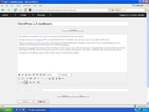
Michael also dissects the design of the WordPress ‘Write Page’ screen. The ‘Write Page’ is probably the most important one for the blog author as that’s where he spends most of his time. I agree with Michael - the page is cluttered with unnecessary distractions
Compare the WordPress page with the ‘blank canvas’ presented by the article editor in Habari.